Looking Back - The Cinematography of The Shawshank Redemption
The Shawshank Redemption (1994) tells the story of a successful banker who is sent to prison for life for the crime of killing his wife in spite of professing his innocence. Along the way he befriends a fellow inmate, ‘Red’, who serves as the film’s narrator, guiding us through the inner worlds of each of its characters. The film explores themes of resilience, tenacity, and the importance of hope.
Telling a story with light
In one of the early sequences of the film, a line of new inmates is marched into a large open hall, that is dark, but with bright light streaming in through large, almost church-like windows behind them. Upon command, the inmates turn, and, like a prison door slamming shut, their long shadows jut out across the polished stone floor. Surprisingly, it is one of the few times the visual device of prison-bar shadows is employed in the film, and notably it is the inmates themselves that form the shadows. The implication seams clear: we are the bars that hold us in. We are primed from the start to understand this is going to be a story mostly about psychological, not physical, strength/weakness.
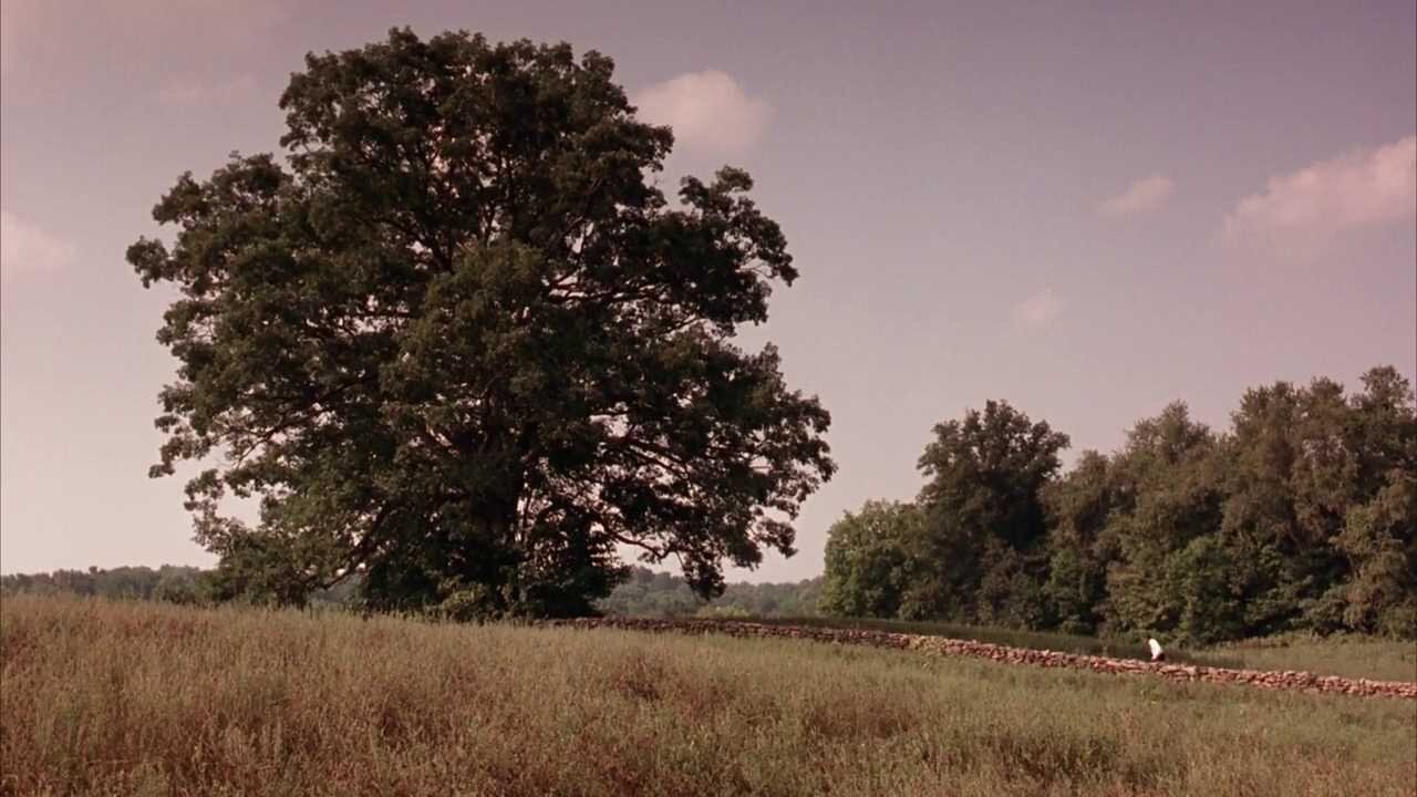
Watching the film again, I was struck by how much it doesn’t look like what one might expect a film like it to look like. Yes, it uses the drab color schemes of a 1950’s prison (the crew apparently experimented with dozens of paint samples to get the right tone and reflection), and yes, there is plenty of darkness and gloom on the screen. But this is not a depressing looking picture. Much of film is subtly pretty and largely devoid of typical prison film clichés like dripping taps, bugs crawling up the walls, or, prisoners perpetually entrapped by striped shadows.
I suppose one could argue it is a visual ‘soft-serve’ in that respect. While we see our protagonist suffer physically, we are spared the more graphic details. But The Shawshank Redemption is, first and foremost, a story of hope and mental strength, and thematically I think it works in this way. Its a picture of the main character’s psychological state, which wavers in an out of the shadows, but is never fully engulfed by them.
The use of light throughout the film as a persistent motif for freedom and hope is employed with great discipline and effectiveness. Its never squandered on cheap visual devices.


Deakin’s Style
After reading up on the film’s legendary cinematographer, I realized the film’s visual restraint should come as no surprise as it is very much in keeping with Roger Deakins’ philosophy as a shooter.
“There’s nothing worse than an ostentatious shot,” Deakins argues. “Or some lighting that draws attention to itself, and you might go, ‘Oh, wow, that’s spectacular.’ Or that spectacular shot, a big crane move, or something. But it’s not necessarily right for the film — you jump out, you think about the surface, and you don’t stay in there with the characters and the story.” - Deakins speaking to NPR
After being nominated for The Shawshank Redemption (the film was released to critical approval but was largely unsuccessful initially in the box office), Deakins would have to sit in the audience through thirteen more Academy Award ceremonies before finally being invited up on stage to receive an Oscar for Blade Runner 2049 (check). Along the way he consistently produced outstanding work as the Cohen Brother’s chosen cinematographer, as well as working with directors like Denis Villeneuve, Norman Jewison, and Sam Mendez.
I wonder if his ‘style’ - or lack thereof - was a factor in why remained so respected - particularly amongst other cinematographers - but was often passed over for the Oscar. According to Deakins, it wasn’t something that bothered him because it meant people were paying attention to the films and the characters.
‘I hope I have a style that suits the film I am. Working on’. - Roger Deakins
Deakins’ style is intrinsically linked with the story and characters. He often mentions in interviews the importance of keeping the viewers in the experience. It is something that comes across in The Shawshank Redemption, where every shot and sequence is carefully choreographed, every light placed with the greatest intent to serve the story. To me, it is like watching an expert figure skater’s polished routine. It looks so fluid and natural, you don’t notice the difficulty of the moves.
He mentions being particularly pleased with the film’s consistency and simplicity, and I agree. The consistency of style, color, and visual language throughout hold you clenched in the world of the characters and their stories. You don’t drift out of the film, distracted by unnecessary elements.

Not that there are not some beautifully composed sequences, such as the rooftop scene that Deakins cites as his favorite in the film. Its a very complex setup, each character meticulously placed in the frame, the narration, lighting, camera movements all coming together to tell the story.
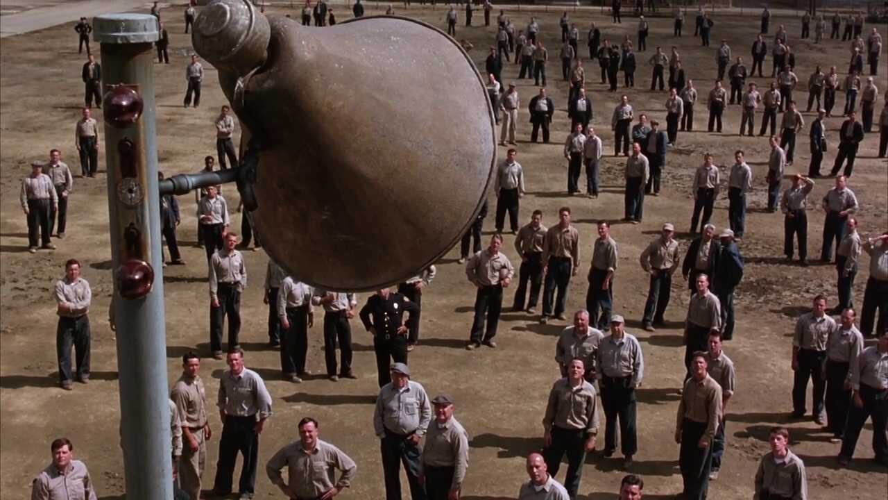
The film maintains a heavily claustrophobic feeling throughout, which achieves by establishing a set of visual motifs and then sticking to them rigidly. The interior is drab and muted. There is the warm light always trying to break into the shots from outside (more or less so I think depending on the mental state of the characters). There is the relative openness of the yard, but always the walls and fences.

Towards the end, when Red’s character is finally granted parole and he is set free, he steps outside the prison, but there is still one more stone wall in front of him visually: the other side of the gatehouse. I think it implies that he may be free physically but he is still not free mentally, and that he could go back inside any time.
It is only towards the film’s final sequences that the motif relaxes, the walls fully fall away, the skies open up, and our character is truly free of both his physical and mental walls. You can almost breathe in the warm open air with him. By then it feels like we have all broken free.

As a shooter, Deakins is known for being a meticulous planner, but also being open to ‘Happy accidents’. He strives to achieve an emotional connection with the characters and the story. He prefers working traditionally over extensively utilizing CGI, but again it seems this is not so from a rejection of the technology but because of his obsession with authenticity and keeping viewers immersed in the story.
Practically, when working he likes to be behind the camera, so he can respond to the action, as opposed to watching a monitor and using a camera operator. He favors shooting with ‘prime’ lenses. These are lenses with fixed focal lengths as apposed to ‘zoom’ lenses. He cites using a 27mm a lot, which is a slightly wider angle, and means the cameraman needs to be in quite physically close to the actors when shooting, creating an sense of intimacy and immediacy.
Hearing that, it doesn’t surprise me to learn that he comes from a traditional photography background, as this is arguably a more classic way of shooting. It does mean that much of the background of the shots are more in focus and not abstracted out, which requires you to ensure that everything behind the character has a purpose to the story and is not just visual wallpaper.

For myself, it was hardly a chore revisiting this amazing film that I have possibly now seen half a dozen times, and I could highly recommend re-watching this classic while paying attention to the fluid camera work, set-pieces, and how the use of light plays an integral part to telling the film’s story.

References
The Shawshank Redemption (1994) – One Shot
Roger Deakins IMDB
The Shawhank Redemption on Rotten Tomatoes
Roger Deakins Explains Why He Insists on Operating the Camera Himself — Watch – IndieWire
Roger Deakins Cinematography Tips & Techniques
The Filmmaker’s View: Roger Deakins – Personal connection through cinematography
Roger Deakins: On Lighting
Watch “Roger Deakins Cinematography Style in 6 Steps” on YouTube
Shawshank Redemption on Wikipedia

